A Room for Nick – Interview with Mousse magazine about the hotel room King designed for his friend, the late Nick Sanderson
Mousse magazine, 14 November 2014.
Lira Hotel, the project created in 2007 and curated by Jonathan Monk and Sonia Rosso, has recently been expanded, with a third room by Scott King. The project is now acquiring a wider dimension, and becoming permanent. In the near future, new rooms by other artists will be opened in different locations and cities.
The Lira Hotel project provides hotel rooms to be fitted out: artists are invited to dress a room, both with structures aiming to distort the initial space, or the room could be also dedicated to objects and furniture production such as wallpaper, sofas or coffee tables et al.
The rooms could be also sold, to leave the space for a new artist’s room.
MOUSSE: Your project for the Lira Hotel entitled A Room For Nick, is a room for Nick Sanderson, the lead singer of the band Earl Brutus. What influence did Nick have on your life and artwork?
SCOTT KING: Nick was huge influence on me, as he was on many people who knew him. Perhaps his other friends feel the same way as I do. Since he died in 2008, I’ve thought about him a lot – and I still laugh out loud when I remember some of the scrapes he used to get into, and the lunatic plans that he’d come up with.
I’ve said this many times, but I think he was perhaps the only genius I’ve ever met. He didn’t do that much really – I mean, he made songs of course, some of which were great. But his genius was really in his manner, in his ideas and conversation. He was, I suppose, a ‘pub-genius’. He was the best company you could ever wish for – full of ideas and schemes – most of which were comedic/hateful takes on his frustration at the world. One of his great unrealized plans was to build a concentration camp on the Isle of Wight, where he would imprison only celebrities. It was there that he planned to imprison Simon Cowell, melt him down and turn him into a HB pencil.
He also used to sit and plan ‘airport novels’ – bestselling, generic, boring novels that were bad enough to be stocked in every airport and appeal to the ‘average reader’. One of these was called The Bargaining Tree – it was about a middle-aged divorcee. Nothing much happened in it, it was utterly dull – so in his mind, it would therefore appeal to dull people and become a huge best seller. His idea for the image on the front cover of the The Bargaining Tree was that’d it’d just be a mug tree, maybe on a slightly murky white background… you know, really depressing! So, that’s why I made the huge mug tree - a mug tree that’s also coat rack.
The Bargaining Tree would then be followed by its sequel, The Margaret Agenda. From what I could understand The Margaret Agenda was to be even more boring than The Bargaining Tree. He had many ideas like this. If you sat with him he’d just reel off all these plans. He was a very funny and clever man… a true artist in my opinion.
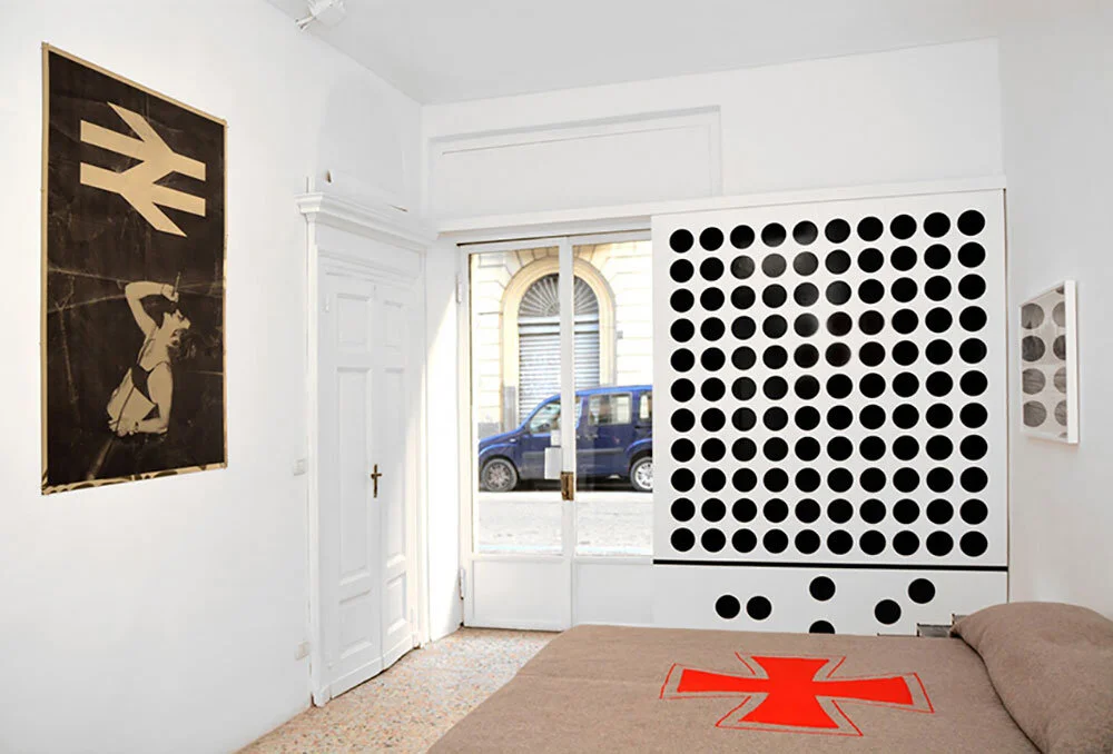
So, the room at Lira Hotel is really not a ‘shrine’ or a ‘memorial’ to Nick – I didn’t want it to be that at all. It is, I hope, a room he would’ve loved to have stayed in. All the objects/work in the room relate to Nick in some way. Some are personal and anecdotal, some relate to his ideas – me interpreting his ideas. And some are just things I’ve made up that I hope he would have liked.
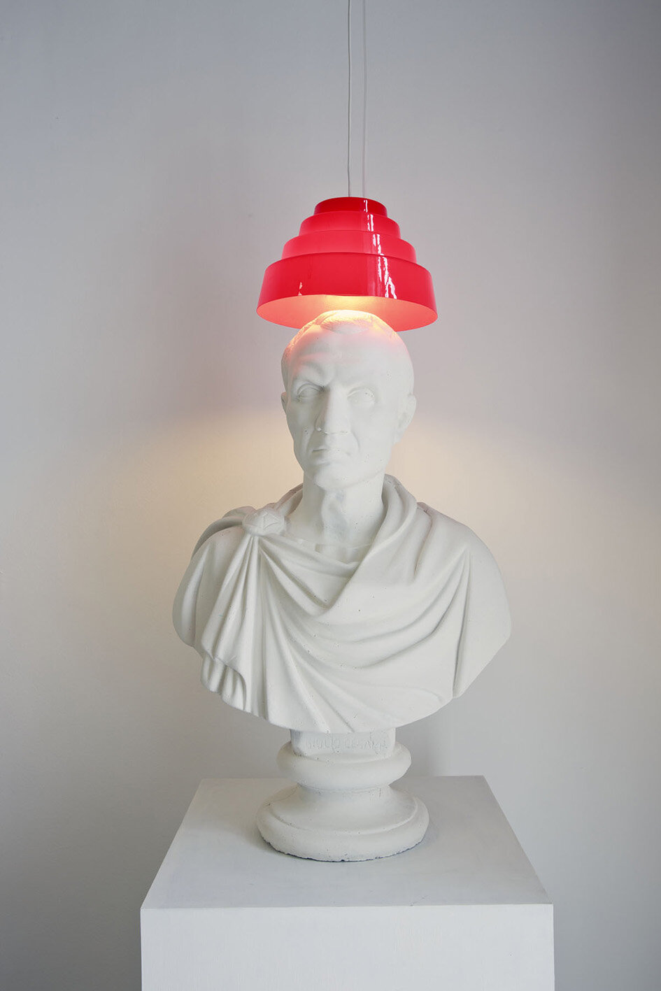
Are We Not Men?: A Lamp, 2013. Cement bust, Devo Energy Dome, light bulb, electrical cable, 62.5 x 47 x 36cm / 24.6 x 18.5 x 14.1 in.
MOUSSE: Did the work for this project give you a chance to go further into the dichotomy between graphics and art? Your artworks in the room have a practical purpose (a blanket, a shower curtain etc). Without starting a debate about art versus design. I’d like to know if you were comfortable with the task of creating these objects.
SCOTT KING: I think this was part of the excitement of the project… making work that was very clearly a hybrid of art and utility. It’s long been an ambition of mine, so this was a great opportunity to do that kind of work – and it is NOT ‘design-art’. I think of it as ‘stuff’. Work that has its roots in pop, art and design – work that incorporates all these elements but is not easily categorized as either one of these things. Sort of ‘utility art’. What also helped was that I had a very clear audience of one – Nick. And his interests were so specific, if a little eccentric and specialist, that it helped me to focus. If in doubt, I simply made what I thought he would have enjoyed.
RELATED CONTENT


